
If you work with data, you know the routine. You receive a .parquet file—packed with valuable
information—and your first thought is, "How can I quickly see what's inside?"
Traditionally, this meant firing up a Jupyter Notebook, importing pandas and
pyarrow,
writing several lines of code, and tweaking matplotlib or Plotly settings just to
get a basic chart.
It works, but it’s slow. When you just need a quick look, the setup feels like overkill.
What if you could skip all of that and just… see the data? Now you can.
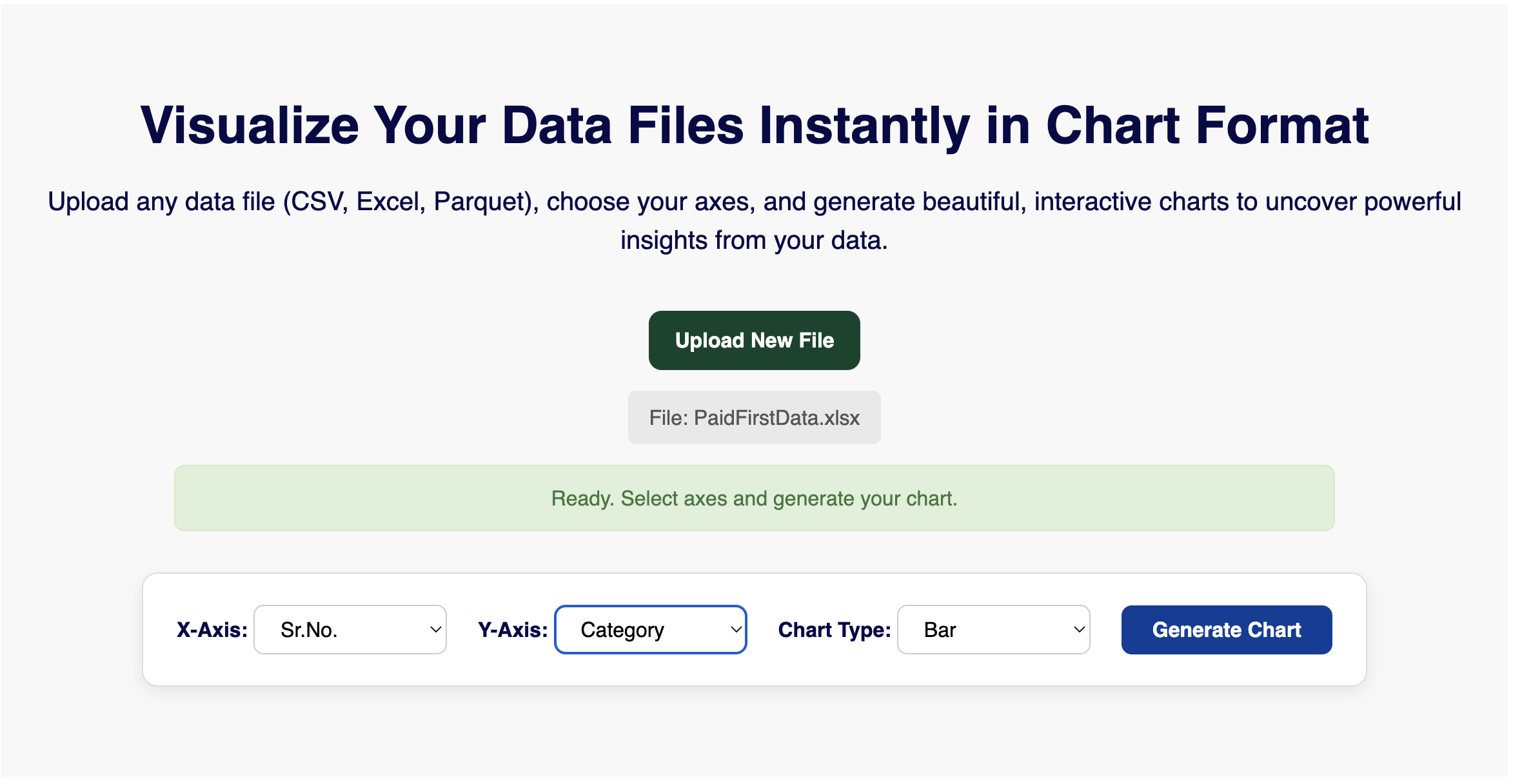
Introducing: The Parquet Data Visualizer by ParquetReader.in
We’ve built a no-code tool that takes you from a raw Parquet file to an interactive chart in less than 60 seconds — all in your browser.
The Problem: The “Quick Look” Isn’t Quick Enough
Parquet is amazing for storing large datasets efficiently. But its compressed, columnar format is a barrier to casual inspection.
You can’t just open it in a text editor or drag it into Excel. This creates a frustrating gap for:
- Data analysts who want to validate a dataset before loading it into BI tools.
- Data engineers needing to spot-check pipeline outputs.
- Business users who just want a chart — not code.
- Anyone asking, “What does this data actually look like?”
The Solution: Drag, Drop, Visualize
Our visualizer removes all friction. It works in 3 simple steps:
- Upload Your Parquet File: Drag and drop it directly into the page.
- Select Your Axes: The tool reads column headers and auto-populates dropdowns.
- Generate Your Chart: Choose chart type (Bar, Line, Pie) and click "Generate".
Why This Changes Your Workflow
- 📊 Instant Sanity Checks: Spot trends, gaps, or skews in seconds.
- 💡 Explore Effortlessly: Switch axes and chart types freely without rewriting code.
- 🤝 Bridge the Technical Gap: Non-tech teammates can now explore data visually.
- 🔎 Pre-Conversion Preview: Get a visual summary before you convert Parquet to Excel or export to CSV.
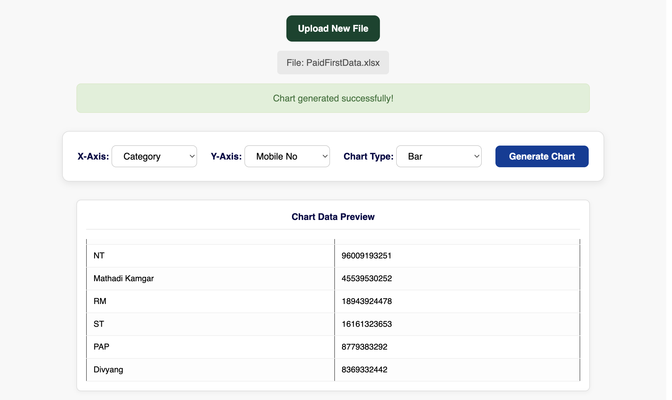
See the Data Behind the Chart
Every chart is backed by a Data Preview Table. When you generate a chart, the tool shows the aggregated data (e.g., totals by category) right below it.
This ensures transparency and builds trust — you always know exactly what numbers your chart is representing.
Try It Now — Free & Instant
Don’t let code get in the way of your insight. Next time someone sends you a .parquet file, skip
the scripts. Just drag, drop, and get your answers.